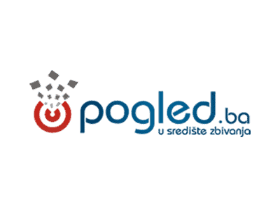
Rebranding Pogled.ba
Branding & Web solutions
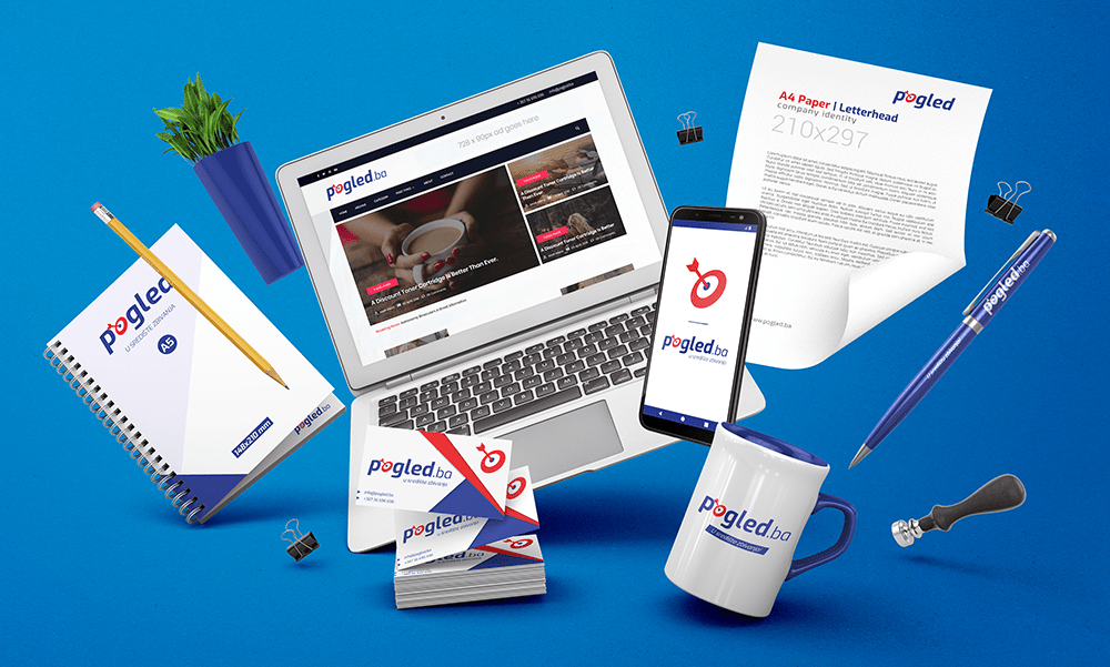
Designing a company’s visual identity, in the first place, requires an understanding of the nature of the business that the company is engaged in. The visual identity is developed in order to present the basic features of the activities of the Pogled.ba portal in a modern and contemporary way. In the creation of the logo, the emphasis was placed on the intervention in the letter “o” which means a hit in the center, which is in addition to the slogan “In the center of events!” direct association to the activity of the portal. A new color palette was introduced to give freshness to the identity of the portal, emphasize serious business and the authenticity of the information published by the portal.
New visual identity has made a step further towards the goal; earning trust from the users, quality and truthful media portal!